Make left and right unambiguous in your grey map
Write 'my left temple' and 'my right temple' on the placement sketch rather than relying on which side of a photograph they occupy. Give each important photo a matching label. If a selfie reverses the view, tell the maker before using it to discuss an uneven blend. Mark the usual parting separately from the lighter areas, so the line dividing the hair is not mistaken for the boundary of the grey you want.
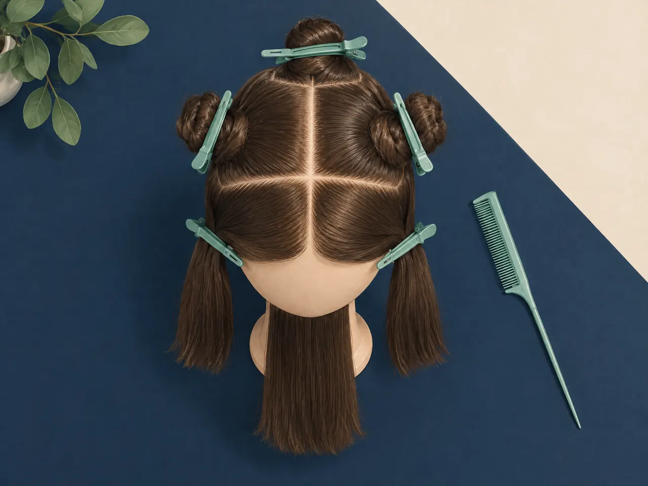
Use the sectioned practice head as a reminder to discuss one area at a time. It is not a grey-percentage diagram: the size of a section does not specify how much grey belongs there. Ask the maker to read your zone notes back to you, especially when the two temples have different priorities.
Explain which grey details the fringe should reveal
If you want a lighter front or temple to remain noticeable, include a reference with the fringe arranged as you normally wear it. Tell the maker whether the detail matters with hair swept aside, falling forward or tucked behind an ear. Those are separate viewing requests, not an instruction to increase the grey throughout the piece. Ask what can be demonstrated with the available sample before agreeing to the placement.
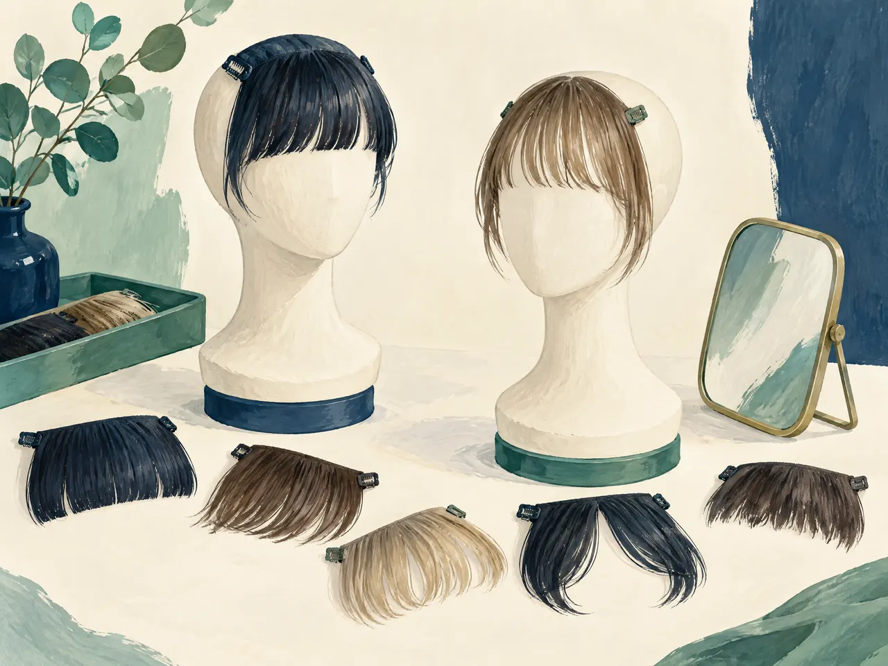
A detachable practice fringe illustrates the question to ask, not a promised custom design. If you also want a new fringe shape, label that as a change from your colour reference. Resolve whether the preferred grey detail should still be visible with that change, rather than approving the colour and cut as unrelated decisions.
Separate the colour you want from the length in the picture
When an older photograph has the right grey blend but the wrong length, label it 'colour and placement only'. Supply a separate reference for the intended ends. For example, a picture may show the darker back you want to retain while your new cut would finish above the collar. Ask how that colour priority can be discussed for the shorter outline; do not assume the old photograph describes the whole finished piece.
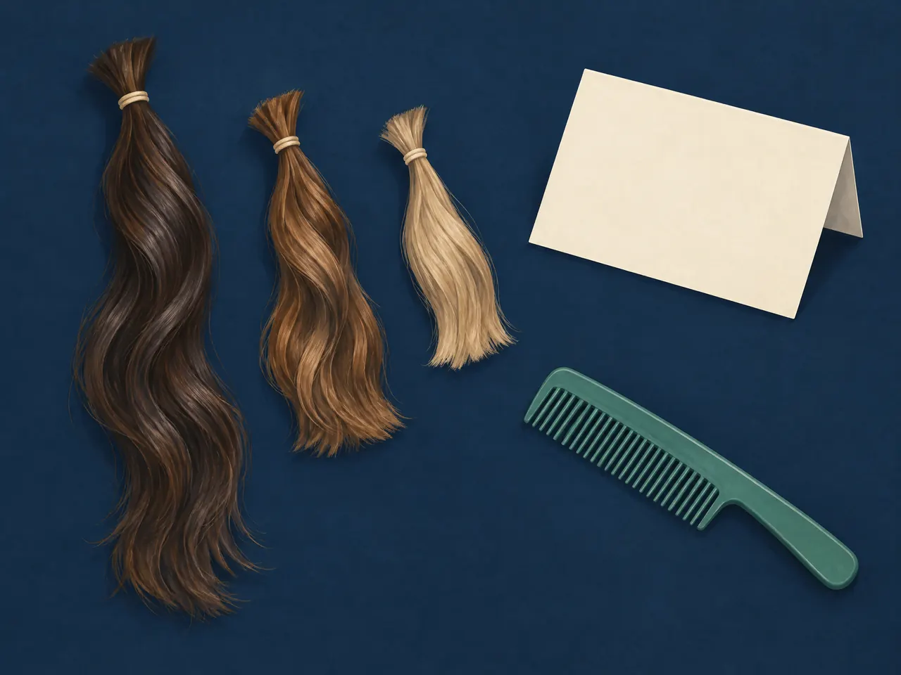
Keep an uncropped version alongside any detail image. The close-up can identify a temple or dark base, while the wider view explains where it sits within the hairstyle. Separate practice tresses of different lengths are a reminder to record length independently, not physical references for a grey blend.
Use lighting notes to explain a conflicting colour reference
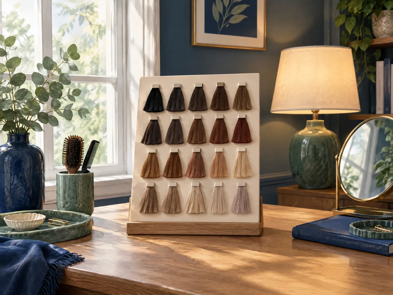
If the shortlisted reference seems suitable near a window but too pale under your usual indoor light, record both observations beside the same sample name. Do not replace it with an unrelated screenshot or average the appearance of several pictures. The American Cancer Society recommends natural light for a physical colour comparison, while OWNSTRAND notes that lighting and screen settings affect reference images. [1] [4] Use your indoor observation to explain what concerns you, not to calculate a different percentage.
Before changing the brief, ask whether you are comparing the same physical reference and the same part of it. State the concern narrowly, such as 'I prefer the darker component in this view'. If no physical comparison is available, keep that uncertainty in the written record rather than treating a screen image as a settled colour approval.
Keep the grey component in the material record
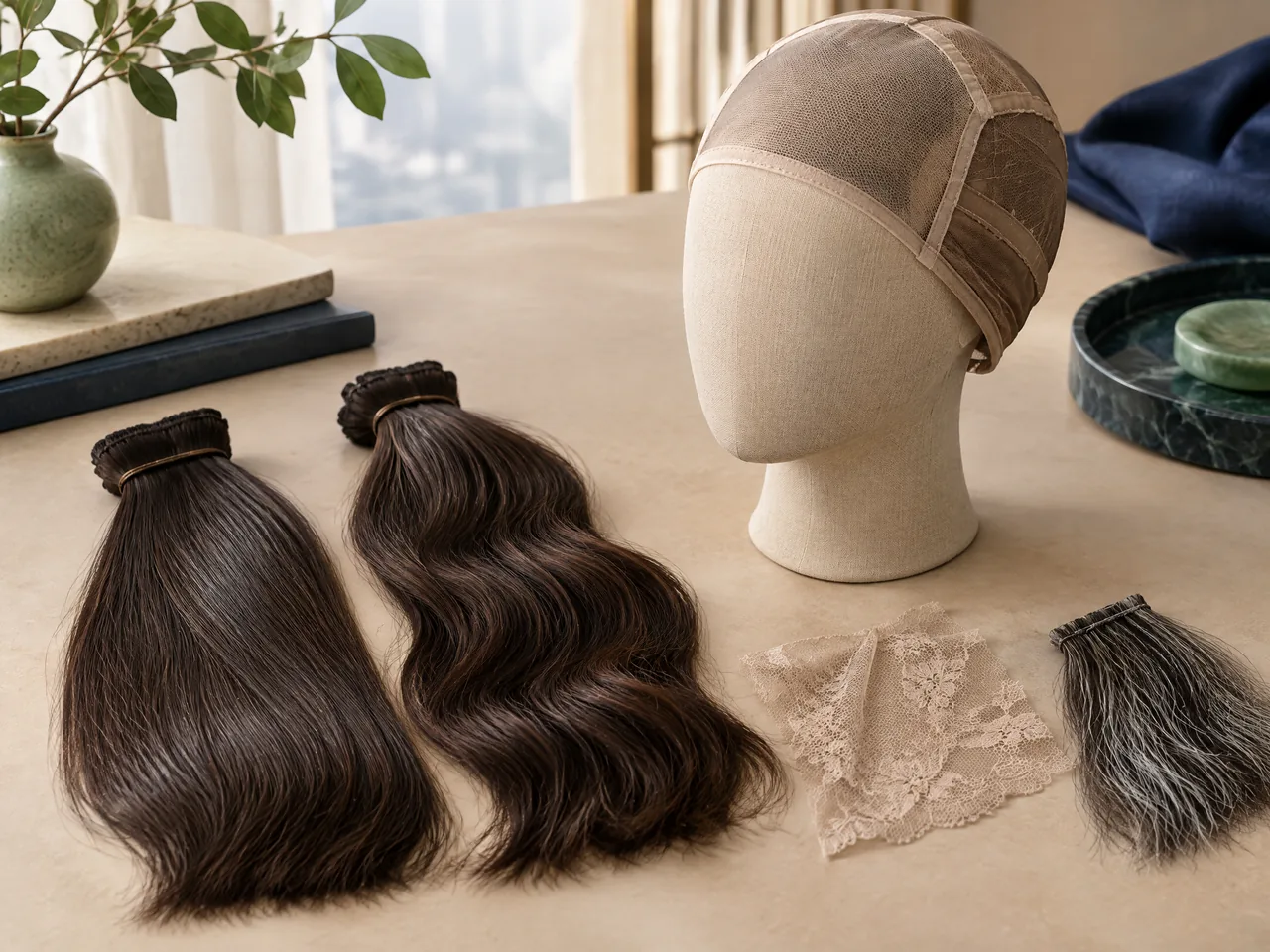
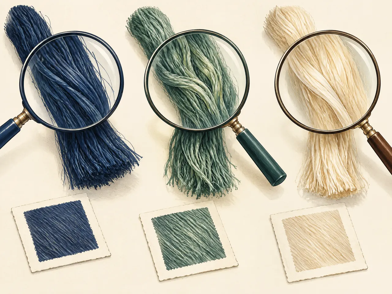
Alongside the colour brief, ask for a written description of the fibres intended for the darker and grey components. Also ask whether the sample demonstrates the materials of the proposed piece or colour alone. Leave an unanswered material question visibly unresolved; a pale strand's appearance should not substitute for the supplier's specification. The sample bundles are a prompt for these questions, not a way to identify fibres by looking at them.
If keeping the agreed appearance depends on a particular care routine, ask the maker to connect that advice to the confirmed materials. Record any restrictions on recolouring or styling before accepting the brief. This keeps the colour decision tied to the piece you will maintain, rather than assuming every hair-like fibre can be handled in the same way.
Draw the coverage boundary if the reference is for a topper
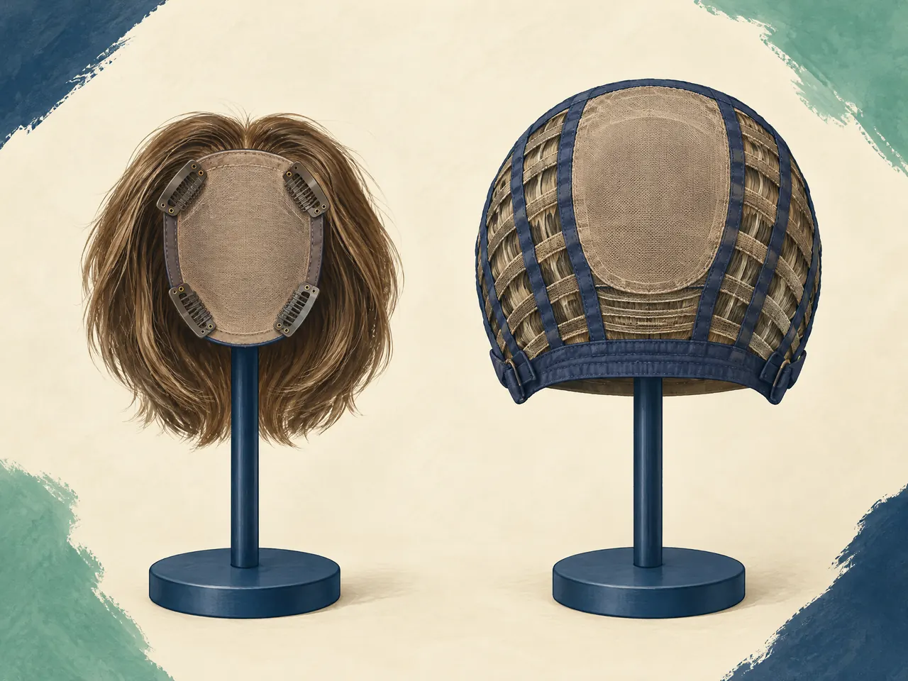
For a topper enquiry, draw its proposed coverage boundary on a separate sketch from the grey-placement map. Mark which surrounding hair you expect to remain visible, then identify the colour reference for that hair. A full wig and a topper cover different areas. [1] If a pale temple you want to preserve lies outside the proposed coverage, explain that it belongs to your visible surrounding hair, not automatically to the supplied piece.
Ask the maker which parts of the combined appearance the enquiry can address. A request for a darker crown and lighter sides may involve both a hairpiece and your own hair; do not let one overall percentage stand for both. Keep the coverage discussion open until the product and position have been confirmed, then apply the colour brief to that defined area.